Dangerously Cute: Using Brand Mascots as Political Propaganda
When the Amul Girl mascot was created in 1966 to represent an Indian brand of butter, she was immediately a hit with households across India.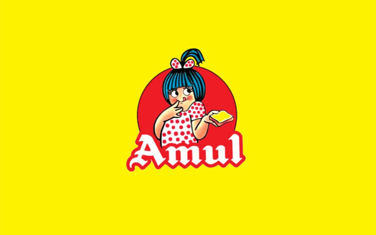 The branding was created to help the Indian company compete with Polson's, a company who had a monopoly on the market until the 1960s. The light skinned, slightly chubby, adorable girl with the blue-haired bowl cut immediately won hearts, and brand loyalty. She quickly became a pop culture icon and came to represent the upper class and liberal politics in India. The messaging on the ads has evolved through the years and over the last six years, the messaging has shifted to pro-state propaganda and Hindu nationalism. Amul is now being used to normalize harsh government laws and pro-surveillance laws.Learn more and see examples here in this video created by artist and designer Kruttika Susarla: https://youtu.be/znMcCUH8aq8Sources:https://designincubation.com/publications/abstracts/utterly-butterly-propaganda-an-analysis-of-illustration-as-a-tool-of-persuasion-in-amul-ads/
The Controversial Kamala Cover
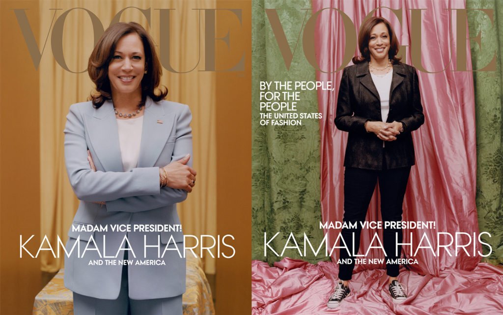 The February Vogue covers of Vice President Kamala Harris have stirred up a heated debate on social media. While many debate which cover is more appropriate, the issue also raises the question of, "what is the responsibility of a publication to their subject?"Both covers were shot with the collaboration of Vice President-elect Harris, who chose and wore her own clothes, however, the Vice President's team has said they felt blindsided; the cover on the left in the blue suit is the one that they mutually agreed upon. Contractually, Vogue had the final choice. Harris' team feels they acted in bad faith.Vogue has said their choice speaks to the approachable nature of the Biden-Harris team and that the more informal image represents this. Editor-in-chief Anna Wintour has defended the choice and has gone on the record saying that their intention was not to diminish the importance of Harris' victory. Vogue responded to the controversy by releasing the more formal image as the digital cover.Critics feel the print cover image is disrespectful and does not represent her game-changing position, as the first female vice president, the first Black female vice president and the first female vice president of South Asian descent. Vogue has also been accused of lightening her skin tone.While Vogue makes a point with their argument and legally it looks like they are covered, the question remains, did they act responsibly toward their subject? They were given an opportunity to convey the essence of this pivotal moment in history, perhaps they should have done so with no explanation needed.Sources:https://www.nytimes.com/2021/01/11/style/kamala-harris-vogue.html?auth=login-email&login=emailhttps://www.nytimes.com/2021/01/12/opinion/sway-kara-swisher-anna-wintour.htmlhttps://www.today.com/style/anna-wintour-speaks-out-kamala-harris-vogue-cover-t205582https://www.dnaindia.com/world/report-us-vice-president-elect-social-media-outraged-over-lightening-of-kamala-harris-skin-tone-on-magazine-cover-2867608
The Ad Council gets their moonshot moment
The Ad Council has a 78 year history of partnering with the best advertising minds in the country to create marketing for complex social issues. They have already been working on what some think will be their biggest one yet, their "moonshot moment." They have launched a series of national PSAs and multi-channel content to provide critical and urgent messages to the American public. The campaign site features a Coronavirus Response Toolkit with access to materials to support and help spread the word about three key issues: Mask Up, Mental Health, and Social Distancing.Like campaigns in the past that enlisted the help of celebrities like Elvis Presley to spread the message about the safety of getting the Polio vaccine, they have enlisted the help of contemporary celebrities and influencers to launch on a variety of digital platforms like the twitter campaign seen below.https://twitter.com/AdCouncil/status/1320791468353691655?s=20 They are also well aware of the Black men and women who are being disproportionately affected by the pandemic who are three times more likely to contract the virus, and five times more likely to land in the hospital. They have launched a campaign called "The Power of Us" to specifically illustrate COVID-19 safety guideline to Black Americans.In January, they will be launching a $50 Million campaign to educate the public on the new vaccine, the largest public initiative in its history. They have the help of infectious disease and public health experts from John Hopkins University, Duke University and more.They have a tough challenge ahead of them with a survey done by COVID Collaborative indicating that only one-third of Americans plan to get vaccinated. The Ad Council's goal is to reverse this trend with unified and consistent messaging. In a world with a multitude of media platforms and channels, it will indeed be their moonshot moment.Sources:https://www.adcouncil.org/campaign/coronavirus-preventionhttps://www.goodhousekeeping.com/health/a34937387/ad-council-coronavirus-vaccine-campaign/https://www.npr.org/sections/coronavirus-live-updates/2020/12/04/943151549/and-now-for-an-important-message-convincing-you-to-get-the-coronavirus-vaccinehttps://www.nytimes.com/2020/11/23/business/media/ad-council-covid-vaccine-skeptics.html
Imagine a world without logos
Logorama from Marc Altshuler on Vimeo.The award-winning animated short, Logorama, does a wonderful job of showing how pervasive branding is in our lives in a clever and satirical parody.The art of crafting logos and creating brand identities has long been a mainstay of graphic design. Schooled in creating icons, it's hard to find an advertising or design company that doesn't have a dedicated section in their online portfolio for branding.In 1999 Naomi Klein wrote the bestselling book, "No Logo," where she reported on the dangers of global branding and how while our minds were elsewhere, superbrands ramped up their cannibalization of every aspect of our cultural lives. Klein critiqued the political power of superbrands.Twenty years later, branding is bigger than ever. People are encouraged to create their own personal brands. There are courses offered in it. High school counselors, job coaches, and other well meaning folks all stress how important this is.On the other hand, people are told personal branding is meaningless in an article by Fast Company aimed at Generation X. The article encourages them to seek out their professional ethos rather than their brand.Brands have become even bigger than Klein had predicted, with bespoke design soaring as a discipline, and entire branding companies describing themselves as bespoke brand specialists. Music festivals, charity events, product placement, social media, sports teams, and more are co-opted by logos of the brands they represent as companies strive for "brand engagement."Whether it is embracing our brand, rejecting our brand, or seeking to create a bespoke brand—the common denominator throughout is indeed branding. There's no question that creating the symbols for them—logos—is bigger than ever.Can you even imagine a world without logos?Sources:https://www.theguardian.com/books/2019/aug/11/no-logo-naomi-klein-20-years-on-interviewhttps://www.fastcompany.com/90385831/you-are-not-a-brand?partner=rss
Designing Race

Isotype (International System of Typographic Picture Education) and its founders, Otto Neurath and Gerd Arntz, were among the first to create the pictograms we see all around us. Started in the 1920s, this form of visual communication was designed for a language-like consistency, allowing for quantification and comparison.
The Noun Project boasts that they have icons for everything, in fact, over a million of them—curated by a global community. Despite this multitude of icons, Noun Project member Erika Kim wrote a blog post last year about the perils in depicting race in iconography.
Icons work best when they are simple and concise while depicting things that are often complex. Kim writes that as a result, creating icons that depict race and ethnicity accurately and respectfully is a design problem waiting to be solved. Visual conciseness can quickly turn into overgeneralization and depictions of race often rely on outdated tropes and stereotypes. The results can articulate or perpetuate prejudices and bias.
Kim offers the following advice when designing icons that depict race:
- Ask designers to represent themselves—authorship can be the best way to reclaim your voice
- Seek feedback from a diverse crowd—present work to people of all ages, races, and ethnicities—look for the blind spots
- Aim for comprehensive representation and include as many variations as possible to fit many contexts
- Be aware of implied hierarchies and values and know the history of representations
- Create new or abstract interpretations
Finally, Kim urges designers to not be afraid to try. The world is full of misrepresentations because of this. Be brave and break through to create new and better representations.
Sources:
https://blog.thenounproject.com/depicting-race-in-iconography-4ee4e4269875
http://www.eyemagazine.com/feature/article/icons-for-the-people
What's so bad about Millennials anyway?
Karmarama, a digital ad agency based in London, has taken the negative stereotypes aimed at millennials and turned them upside down by looking at the potential behind them instead. The selfie generation is celebrated for their self-belief, binge gamers have drive, phone zombies have focus, and snow flakes have compassion. It's a campaign that takes aim at unfair stereotypes while addressing the contextual challenges in Army recruitment.This is the third campaign from Karmarama for the Army and so far the campaigns have been a huge success. They have resulted in Army job applications being at a five year high. Along with their core messaging, the campaign has utilized dynamic creative optimization to make messages more tailored and persuasive the closer candidates get to the application.Sources:https://www.commarts.com/exhibit/the-british-army-ooh-posters?utm_source=Communication+Arts+Daily&utm_campaign=5e9404cc74-RSS_EMAIL_CAMPAIGN&utm_medium=email&utm_term=0_a6a0e887e3-5e9404cc74-35104113https://www.thedrum.com/news/2019/01/03/british-army-targets-snowflakes-and-me-me-me-millennials-2019-recruitment-ads
Trump-Pen-an-ce
![]() I know the man's name is Pence, but I can't help seeing "Penance," and wondering what we've done wrong as a nation that was so bad to deserve this.As critics and comics alike discussed the pros and cons of the newly revealed logo before social media prompted them to revise it a day after its release and take away the charming monogram, it's wise to keep our minds on the essence of logo design—it stands for a brand. Along with the obvious sexual associations of the "T" penetrating the "P," it may also be prophetic in predicting what may be about to happen to our country.What can graphic designers do about the impending penance? Making signs and posters is one way we can use our skills as they did this past March when they protested outside of Trump Tower holding 40-inch-by-60-inch signs of bold, graphic letters that together spelled "Build Kindness Not Walls."They may also want to take some ideas from the "Black Lives Matter" movement and see how graphic designers have been helping to fight racial injustice. Using data from news reports, some are creating shareable data viz, while others are creating memes to help get the word out.As the GOP Convention launches into full swing today, it's fun to analyze branding in terms of its design qualities and symbolism—but it's even more important for us to look at our social responsibility and see where we can help to combat the impending penance looming in our nation's future.Sources:http://www.wired.com/2016/07/ins-outs-new-trump-pence-logo/http://www.fastcodesign.com/3057904/how-graphic-designers-are-protesting-trumphttp://www.fastcodesign.com/3061779/how-designers-can-help-the-black-lives-matter-movement
I know the man's name is Pence, but I can't help seeing "Penance," and wondering what we've done wrong as a nation that was so bad to deserve this.As critics and comics alike discussed the pros and cons of the newly revealed logo before social media prompted them to revise it a day after its release and take away the charming monogram, it's wise to keep our minds on the essence of logo design—it stands for a brand. Along with the obvious sexual associations of the "T" penetrating the "P," it may also be prophetic in predicting what may be about to happen to our country.What can graphic designers do about the impending penance? Making signs and posters is one way we can use our skills as they did this past March when they protested outside of Trump Tower holding 40-inch-by-60-inch signs of bold, graphic letters that together spelled "Build Kindness Not Walls."They may also want to take some ideas from the "Black Lives Matter" movement and see how graphic designers have been helping to fight racial injustice. Using data from news reports, some are creating shareable data viz, while others are creating memes to help get the word out.As the GOP Convention launches into full swing today, it's fun to analyze branding in terms of its design qualities and symbolism—but it's even more important for us to look at our social responsibility and see where we can help to combat the impending penance looming in our nation's future.Sources:http://www.wired.com/2016/07/ins-outs-new-trump-pence-logo/http://www.fastcodesign.com/3057904/how-graphic-designers-are-protesting-trumphttp://www.fastcodesign.com/3061779/how-designers-can-help-the-black-lives-matter-movement
Branding the Olympics—“worst practices” in design
While the Olympic games themselves are steeped in excellence and “best practices” in athletics—the design of the 2020 Olympic logo has spiraled into an example “worst practices” in graphic design.This past September the 2020 Tokyo Olympic logo that was designed by Kenjiro Sano was scrapped when he was accused of design plagiarism. Sano’s design has characteristics of a logo designed by Belgian designer Olivier Debie for the Theatre de Liege.Initially, organizers defended Sano, but then changed their minds, asserting that using a logo that is not supported by the public is not in their best interests and the success of the Olympics. Instead, they decided to crowdsource the logo design, opening it up to anyone. The organizers received nearly 15,000 entries from people competing for $8,250 and tickets to the opening ceremonies.This week AIGA firmly stated their position with an open letter to the Tokyo Olympic committee. Executive Director Ric Grefé discussed several reasons why crowdsourcing logos is damaging to designers, the highlights follow:
- Crowdsourcing takes advantage of designers, asking them to work countless hours without a guarantee of any compensation. Furthermore, the amount of the proposed award, is much lower than what the appropriate compensation would be for a brand identity that will have global value, being reproduced millions of times.
- By opening the contest to the general public, the committee demonstrates a complete lack of respect for trained and experienced professionals.
- The valuable collaboration with the client when creating a brand identity is completely ignored with crowdsourcing , compromising the ethics and global standards for professional designers.
U.S. designer Michael Raisch’s response to the controversy echoes AIGA’s stance. With over a decade of experience in sports branding, Raisch thinks that crowdsourcing brand identity devalues creative professional careers and thei contributions to the world. He decided to point to the absurdity of the committee’s decision to crowdsource the logo by opening the contest up to three-year-olds, emphasizing the point that crowdsourcing results in amateur work. Raisch created an endearing video about the experience entitled, “A 3 Year Old Explains the Olympic Logo.”The contest just closed this past week—stay tuned for the results—no doubt more controversy is in store.http://eyeondesign.aiga.org/against-crowdsourcing-logo-design-an-open-letter-from-aiga-to-the-tokyo-olympic-committee/http://edition.cnn.com/2015/09/02/sport/tokyo-olympic-logo-scrapped/index.htmlhttp://www.designweek.co.uk/a-three-year-old-could-have-designed-that-the-olympic-logo-made-by-a-toddler/
Un-branding Columbus Day
 For decades, communities and cities have been un-branding Columbus Day. Whether they are appalled at the atrocities committed by Christopher Columbus in his quest to conquer the Americas, or indignant at the idea that their community was “discovered,” the call for the un-branding of Columbus Day has been an angry voice pitted against many passionate supporters.Officially declared a national holiday in 1934, activists seeking to ban celebrations of the day go back as far as the 19th century because of concerns over the Knights of Columbus—an organization thought to be working toward expanding Catholic influence. The call to re-brand it “Indigenous People’s Day” goes back nearly a century ago when the Society of American Indians advocated for change. The city of Berkeley stopped celebrating Columbus day in 1992. Last year cities like Minneapolis and Seattle joined the ranks. This year, at least nine cities across the country will celebrate Indigenous People’s Day instead. In fact, over a dozen states have joined the ranks of those who do not observe it as a national holiday, and each year the number grows.Even if activists manage to convince the opposition to change the name, the bigger battle is likely to be on the consumer front. A quick search for Columbus Day yields tons of deals for shoppers. The Frugal Shopper offers advice on how to navigate the sales over the three-day weekend. There is plenty of advertising ephemera for Columbus Day sales, none for Indigenous People’s Day. Columbus Day has a strong brand identity depicted by a variety of elements: portraits of Christopher Columbus, mighty ships, American flags, stars, and stripes. Indigenous People’s Day has no brand identity, at least that I could find.Which do you think will prove harder, changing the mind-set of those determined to celebrate a famed explorer (aka pirate)? Or those determined to get the best retail deals? Perhaps what we need is a strong brand.Sources:http://digiday.com/brands/columbus-day-rebrand/http://www.smithsonianmag.com/smart-news/columbus-day-now-indigenous-peoples-day-seattle-and-minneapolis-180952958/?no-isthttp://theoatmeal.com/comics/columbus_dayhttp://money.usnews.com/money/the-frugal-shopper/2015/10/07/how-to-navigate-columbus-day-saleshttp://www.washingtonpost.com/news/morning-mix/wp/2015/10/11/more-cities-celebrating-indigenous-peoples-day-as-effort-to-abolish-columbus-day-grows/http://www.smithsonianmag.com/smart-news/columbus-day-now-indigenous-peoples-day-seattle-and-minneapolis-180952958/?no-ist
Branding Whackyweed
 While doing research for this blog post, I discovered there are at least 564 nicknames used for marijuana, about 500 more than exist for cigarettes and alcohol. This may be a sign of times to come for brand marketers as they scramble to figure how to brand the newly legal drug.In fact, designers and bloggers are already hard at work branding marijuana. Last month Creative Bloq published an article about the challenges designers face in rebranding marijuana from illegal to legal. They offer advice about the importance of ditching the street names and using scientific language instead.Designers are also challenged when differentiating between service and product types. Similar to alcohol and cigarettes, marijuana comes in many different strengths and flavors—but it also has a wider variety of uses including skincare products and supplements for pets.Brand experts may differ in their process and their outcomes, but they generally agree that branding is a form of story telling. But what is the story they want to tell? Some proponents of marijuana feel it is a recreational drug, similar to alcohol. If this is the story then we can expect to see these products competing with top Super Bowl advertisers like Budweiser, romanticizing the effects of marijuana, presenting it as the ultimate party drug—sure to win you friends, fun, and make all your problems go away. Others feel that marijuana's story should be about it’s medicinal effects and how it can be used for an overall sense of wellness, healing, and proper nutrition—a panacea of sorts. All of these stories collectively indicate big business is on the way. Companies like Aquarius Cannabis are dedicated to branding marijuana. Their website talks about the “cannabusiness” and the challenges of addressing both market sectors—medicinal and recreational.While such business steamrolls ahead, let us not forget the ethical issues involved. Similar to branding cigarettes and alcohol, graphic designers are likely to find themselves on Milton Glaser’s “Road to Hell” when working in this industry sector. Many would argue that much like cigarettes and alcohol, branding marijuana hits #11 on Glaser’s list, “Design an ad for a product whose continued use might cause the user's death?” Although a bit more complex due to proven medicinal effects and other uses, there’s plenty of evidence that the misuse of marijuana that would certainly put it in the same category.Then there’s the impact of growing marijuana on the environment. It’s estimated that 60-70% of marijuana consumed in the U.S. comes from California. Marijuana is a thirsty plant—using twice as much water as wine grapes. Cultivation of this plant, especially during the current drought conditions, needs to be done responsibly. Ecologist Mary Power recently co-authored a paper for the journal of Bioscience that details the destruction of the sensitive watersheds where cultivation is done and stresses how important it is that the environment be included in the debate on marijuana legalization. Power feels that quasi-legalization increases the difficulty to address the harmful environmental effects and full legalization may make things better from an environmental standpoint.Regardless of your opinion on marijuana, there is no disputing the fact that as the debate continues about its legalization, branding efforts will continue to grow right alongside it—and graphic designers will be navigating these murky ethical waters right alongside as well.Sources:http://www.pot-heads.com/what-are-the-nicknames-for-marijuana.aspxhttp://onlineslangdictionary.com/http://www.fastcodesign.com/3024457/6-branding-lessons-from-the-pioneers-of-weed-designhttp://www.creativebloq.com/advertising/how-designers-are-rebranding-marijuana-61515127?utm_source=Design+Indaba+mailing+list&utm_campaign=6e059e5cdf-Weekly_17_jun_20156_18_2015&utm_medium=email&utm_term=0_eb8e2b1d91-6e059e5cdf-429312541http://www.adweek.com/news/advertising-branding/10-best-ads-super-bowl-xlviii-155441http://www.miltonglaser.com/milton/c:essays/#2http://e360.yale.edu/feature/the_high_environmental_cost_of_illicit_marijuana_cultivation/2895/http://www.livescience.com/42738-marijuana-vs-alcohol-health-effects.html
ISIS—a brand in the making
 We see brands in the making every day; either new brands for start-ups, or redesigns for long established companies. However, seeing the branding of a dangerous and powerful terrorist group right before our eyes is something all graphic designers should take note of.These days ISIS has been changing its brand; “ISIL,” “IS,” and “Islamic State” are all variations that are being used. The symbol above, the black banner comprised of a white calligraphic shahada, represents one of the five Pillars of Islam, positioned over the historical seal of Muhammad. (1) And just like all brands—t-shirts, head scarves, dolls, and other brand collateral are available for purchase to help spread their brand message.Like the Nazi swastika symbol whose meaning in ancient sanskrit is “Well-being, Good Existence, or Good Luck,” ISIS has roots in ancient history too. The original Isis is the Egyptian goddess of health, marriage, and love—one of the first and most important goddesses. While few of us that hear the term ISIS today associate it with the Egyptian goddess, it’s interesting to note the underlying reference and wonder whether or not it was a calculated coincidence. Like the Nazis who adopted the swastika as their symbol for the expansion of their race, ISIS could be evoking the Egyptian goddess as they press forward with the inclusion of the symbol for shahada, which means “there is only one god.”As far as the current evolution of its brand name, experts would caution against changing a brand in the midst of its growth to avoid brand confusion. Muslim leaders in the U.S. and around the world are upset by the evolution of the brand to “Islamic State.” It marginalizes the vast majority of Muslims who are disgusted by the group’s un-Islamic actions. (2) However, it’s no doubt a calculated move and a huge victory for the movement as they seek to recruit young muslims. Using “Islamic State” is a strategic move toward giving the movement religious legitimacy.Compared to the brutal slayings and violence that ISIS is leaving in its wake, the branding efforts may appear to be the least of our problems. However, all we need to do is look at history to see how powerful the branding of evil can be.Notes:1. http://www.printmag.com/daily-heller/branding-isis-isil-is/2. http://www.thesunchronicle.com/vip/opinion/columns/op-ed-why-branding-isis-matters/article_94a652a0-429f-5a1d-9ba9-df375a9f3843.htmlSources:http://www.ancient-origins.net/myths-legends/symbol-swastika-and-its-12000-year-old-history-001312http://www.fdlreporter.com/story/opinion/2014/09/20/branding-isis-matter/15967959/http://www.egyptartsite.com/isis.htmlhttp://nypost.com/2014/06/24/merchants-peddle-isis-branded-clothing-in-indonesia/http://www.atelierworks.co.uk/blog/the-dividends-of-death.php
Brand (un)control
 The London 2012 Olympic logo has been discussed (and criticized) ever since it was unveiled in 2007. With the start of the Olympics only two weeks away, it seemed like a good time to take another look.Branding has always been one of my favorite areas of graphic design. As a graphic designer, I find it to be one of the most challenging areas; as an educator, one of the most interesting. The social implications of branding are often more interesting than the logos themselves. Then of course there is the question of what is "good" branding. Should it be considered a success if it's designed well, made an impact and created brand awareness, or for what it stands for?Before the age of social media the brand experience was carefully crafted and planned. Steven Heller's book, Iron Fists: Branding the 20th Century Totalitarian State, offers a fascinating comparison of corporate branding strategies—slogans, mascots, jingles and the rest—to those adopted by four of the most destructive 20th‐century totalitarian regimes: Fascist Italy, Nazi Germany, the Soviet Union under Lenin and Stalin, and Mao’s China.Fast forward to the 21st Century and the age of social media. A brand identity is no longer tightly controlled from the top down. As soon as it's introduced it's open to feedback from anywhere; control has reversed—it's now from the bottom up.When Wolff Olins was asked by London's Organizing committee to design a logo for the 2012 Olympics they were asked to "inspire a generation." The brand promise was to put the Olympic and Paralympic Games at the heart of contemporary life. With this goal in mind, many would say they've been successful. The logo has inspired a multitude of criticism, parody, and even paranoia. Iran's National Olympic Committee threatened to boycott the Olympics because they said the logo was racist because some believed they could see the word "Zion" in the abstract design. IOC President Jacques Rogge dismissed the criticism. The one thing that everyone would agree on is that since its release in 2007 the logo has been a hotbed of controversy. It's been deconstructed and reconfigured to suggest everything from a swastika to Lisa and Bart Simpson having sex.What do you think? Is the logo "good," and how important has social media been in building the brand?Sources:http://www.davidairey.com/london-2012-olympic-logo-disaster/http://imprint.printmag.com/uncategorized/the-eye-of-the-beholders/http://imprint.printmag.com/branding/spoof-protest-and-conspiracy-london-2012-anti-logos/?utm_source=rss&utm_medium=rss&utm_campaign=spoof-protest-and-conspiracy-london-2012-anti-logos&et_mid=566392&rid=23821332http://www.wolffolins.com/work/london-2012http://news.bbc.co.uk/sport2/hi/olympic_games/9410046.stmhttp://www.nytimes.com/2008/07/31/arts/31iht-IDLEDE2.1.14885119.html?_r=3http://ca.sports.yahoo.com/blogs/olympics-fourth-place-medal/critics-slam-london-olympic-logo-193526099--oly.html
Is Kony 2012 tony, or phony?
 Kony 2012—the slick and emotional video by Invisible Children that has been circling the internet through Facebook posts, reblogs, and other forms of viral marketing—has been under attack this week. Critics are claiming that is irresponsible, self-serving, and a ploy for mass merchandising.With a campaign that asks supporters to "get the kit," some feel that Kony 2012 has become more than a campaign for justice—it's also become a source of revenue for its founders. Posters, bracelets, hoodies, and t-shirts are also for sale there and other places online. Questions about how much money is going to Jason Russell (its co-founder and filmmaker) vs. how much is actually going to the children have been raised. In response to this criticism Invisible Children has posted a response which includes a breakdown of expenses along with their financials.College student Grant Oyston never expected he would get over 2.3 unique views when he wrote the blog post Visible Children: Criticizing Kony 2012. Oyston says he wrote about the issue because he felt that people were jumping on the bandwagon to follow this campaign without doing research into either the organization Invisible Children or the war in Uganda. He said that up until his blog post came up he could find very little written about these issues.The poet Suli Breaks thinks the backlash against the Kony campaign is more a matter of cynicism. In a short response on YouTube he asserts that if the civil rights movement was going on now his generation wouldn't buy it. Suli goes on to say people have jumped from the Kony campaign to the anti-Kony campaign—without researching either stance.Many people, including Op-Ed NY Times columnist Nicholas Kristoff, have come out in favor of the campaign, saying that over the years he has seen that public attention can create an environment in which solutions are more likely. The top education official in Gulu, Uganda, Vincent Ochieng Ocen confirms this view as he explains the complexities of the war that has been waged for 20 years and affects not only Uganda, but other areas of Africa.Oysten and others, including Chris Blattman, a sociologist at Yale University, would argue differently. Blattman says, “There’s also something inherently misleading, naive, maybe even dangerous, about the idea of rescuing children or saving of Africa. […] It hints uncomfortably of the White Man’s Burden. Worse, sometimes it does more than hint. The savior attitude is pervasive in advocacy, and it inevitably shapes programming. Usually misconceived programming.”Another concern voiced by critics is that the campaign capitalizes on people's short attention spans; people will think they have done enough simply by posting one link or wearing a bracelet.When I discussed the campaign with my graphic design students most of them had heard about it, seen the video, and knew of the controversy that it had stirred up. There was a general consensus that they should support the cause, but not the campaign. They also agreed it was an excellent example of branding—acknowledging the slick and well executed video had powerful emotional appeal. This led to a discussion that included brand stretching, greenwashing, and social responsibility. At the very least, the campaign is a catalyst for the discussion of many of the ethical issues involved in graphic design.Sources:http://africasacountry.com/2012/03/07/phony-2012-risible-children/http://www.kony2012.com/http://www.youtube.com/watch?feature=player_embedded&v=dtYhk0K_WcEhttps://vimeo.com/38609658http://www.invisiblechildren.com/critiques.htmlhttp://www.nytimes.com/2012/03/15/opinion/kristof-viral-video-vicious-warlord.html?scp=1&sq=kony%202012&st=csehttp://visiblechildren.tumblr.com/post/18890947431/we-got-troublehttp://www.usatodayeducate.com/staging/index.php/ccp/college-students-blog-post-opposing-kony-2012-campaign-goes-viral
Does Super Tuesday = Super Branding?
Super (aka—very good; pleasant; excellent; extreme; huge; superficial)This Super Tuesday is "make it or break" for the Republican primary candidates. With elections in 10 states across the country they've pulled out all the stops and there's been a huge surge in branding for each of them.The budgets are definitely super — the ad spending alone has nearly topped $10 million with Romney having the most "super" budget with more than half that total coming from the Mitt Romney-backing Restore Our Future. (Read more about ad spending here.)But what about the design side of branding these candidates? Is it super, or superficial? Branding experts Steven Heller (author of Iron Fists: Branding the 20th-Century Totalitarian State,) Debbie Millman (Sterling Brands, President Design Group), and Alice Twemlow (Design Critic) shared their thoughts on a School of Visual Arts Brief last month. All three offer humorous observations, especially Twemlow's comparison of the swash in Newt's logo to a slimy salamandar. Twemlow also remarks that the further right you get, the less care seems to have been taken with the visual presentation of a candidate’s image, with Santorum's logo looking like it could have been created by a DIY business card machine. (Read the full article here.)What do you think? Were the super budgets spent on super branding?Sources:http://jump.dexigner.com/news/24605http://www.miamiherald.com/2012/03/04/2674789/super-tuesday-ad-spending-nearly.htmlhttp://dictionary.reference.com/browse/super-
What's in a name?
Ethics hit home last week when I became personally involved in a case of artistic freedom vs. social responsibility, professional integrity, and branding.
 Ethics hit home last week when I became personally involved in a case of artistic freedom vs. social responsibility, professional integrity, and branding."East End Stories" is a photo essay about people who live or work in the east end of Newburgh, NY. I was inspired to create the series after reading about a mother who lost her son to gang violence when he was only 16. The criteria for those interviewed and photographed was that they have a connection to the location where the FBI had a major gang takedown in May 2010. Everyone interviewed knew my intentions and everyone was asked about how gang violence has affected them. Throughout the project its name was "Living in Gangland."When I completed the work and the exhibit was announced with the title "Living in Gangland" there was an uproar on a community blog. Mudslinging, name calling, personal attacks ensued - it got ugly. With my professional background in branding, I was accused of intentionally marketing Newburgh as "gangland." Since I don't live in Newburgh, I was accused of being a carpetbagger. I also had supporters who urged me to keep the title in the name of truth and artistic freedom and not cave in to censorship.I sifted through this onslaught of feedback—mean, nasty, and irrelevant, along with some that was intelligent and valid. I debated the ethics of the situation; was I just being honest, or could it be seen as exploitative? Was I unintentionally branding the city negatively, or was I being socially responsible in directing attention to people that might otherwise go unnoticed?The old name certainly passed the "Design ROI" test—it was relevant, original, and interesting. In fact when I changed the name and needed help transferring files to the new website, two separate tech people at GoDaddy were quite interested in "Living in Gangland." They immediately wanted to know what the site was about; that's never happened to me when calling for tech help, ever. Even though "East End Stories" passed the "Design ROI" test for relevant and original—it wasn't quite interesting as "Living in Gangland." I had to weigh whether or not the power and irony of the name was integral to the work, or whether it might be unethical to ignore the community's claim that it would be branding their homes with a powerfully negative label and subsequently lower their real estate values.In the end I decided to change the name. It was a matter of respect—respect for the people I photographed—they don't need the added burden of what a negative label might bring. The new name may not be the attention-getter that the old one was, but the new name is equally truthful, even if it's not quite as interesting.
Coca-Cola: generous benefactor or evil brand master?
 Where does one draw the line about whether or not its graphic designers’ moral responsibility to keep their employees and work on something they don’t necessarily agree with or to let them go, adversely affecting their lives as well their families? Should they refuse to work for the client or take the job for the sake of their employees? Coca-Cola Company is local in 206 countries, more than the United Nations. They have 700,000 employees, 50 million retailers, and 50 million customers all over the world. Critics of Coca-Cola condemn the company for encouraging a consumer culture that is unhealthy and economically draining on individuals.In Do Good: How Designers Can Change the World, author David Berman talks about how Coke has branded the nation of Tanzania. In the 1990s they took care of all of their road signage and included the Coke brand on every sign. In some parts of Africa, Coke is considered medicinal and the price of a bottle of Coke is the same as an anti-malarial pill. While Coke is the best selling drink on the continent, a million Africans die each year of malaria. At the same time Coke is heavily invested in the local communities, imagine the economic impact and subsequent repercussions on the lives of those economically connected to the company if Coke suddenly disappeared as well as losing all of the benefits they do provide like road signage and schools.Simon Berry is one individual who decided to see if there was a way to use Coca-Cola's widespread distribution network to deliver something more. In 2008 Berry started a Facebook group to enlist Coca-Cola to help ship medicine to areas that need it. The group grew quickly and generated a lot of positive publicity. Soon after Berry founded ColaLife, an organization dedicated to helping Coca-Cola take simple medicines and other 'social products' to save lives, especially children's lives.
Joe Camel—a brand stretched to the max
 “Joe Camel” and the stretching of the Camel cigarette brand is a prime example of brand stretching at its worst.In David Berman's book Do Good Design he talks about how before the “Joe Camel” cartoon character appeared in the 1980s Camel cigarettes had one percent of the U.S. teen cigarette market. By the time the campaign was stopped in 1997 Camel had 32 percent of this market, and more than 90 percent of six-year-olds could recognize Joe (more than knew Mickey Mouse.)
Political Branding—Masterful or Monstrous?
 The 2008 Obama branding campaign has been deemed one of the most successful branding campaigns for a political candidate and cause. In an interview by Steven Heller for the NY Times, branding expert Brian Collins asserts it’s because they used a single-minded visual strategy to deliver their campaign’s message with greater consistency and, as a result, greater collective impact.The design strategy focused on multiple platforms— cell phones, mobile devices, websites, e-mail, social networks, iPods, laptops, billboards, print ads and campaign events. Using shape, type, and color, the design team created a campaign successfully visualizing emotional messages that conveyed “hope” and “change we can believe in” across the nation and subsequently gained mindshare of the American people.In his book Iron Fists: Branding the 20th-Century Totalitarian State, author Steven Heller asks, “how did a practice as vile as branding become so valued, indeed, the very mark of value?” Heller writes how in the past branding was used for slaves and criminals. Today, cities and colleges have joined toothpastes and soft drinks in the battle for “brand loyalty.”Heller compares corporate branding strategies—slogans, mascots, jingles and the rest—to those adopted by four of the most destructive 20th-century totalitarian regimes: Fascist Italy, Nazi Germany, the Soviet Union under Lenin and Stalin, and Mao’s China. Heller asserts that design and marketing methods used to inculcate doctrine and guarantee consumption are fundamentally similar.What do you think about political branding and how can you tell if it's masterful or monstrous?Sources:http://campaignstops.blogs.nytimes.com/2008/04/02/to-the-letter-born/http://www.nytimes.com/2008/07/31/arts/31iht-IDLEDE2.1.14885119.html?_r=2