Students & Scientists Working Together
Graphic design is used for everything from advertising to information graphics to entertainment. Many feel that graphic design is at its best when it’s used for advocacy. Some go further and ask if graphic designers actually have a responsibility to use their skills to advocate for social causes. If doctors have a responsibility to take care of those that in critical condition, then one can reason that graphic designers have a responsibility to create communication which motivates people to take action on critical issues, like the condition of our planet.The 6th Extinction In-Motion Video Campaigns were created by Carnegie Mellon Communication Design students. The collaboration between the students, scientists, and conservationists was based on the idea that graphic designers can create a bridge between dry scientific data and the population that needs to hear it.In honor of this year’s Earth Day, take a few minutes to see how these students put their skills to work, and think about what you can do with yours.
Je suis Charlie
 “Je suis Charlie” (I am Charlie) has become the mantra for many across the world who are gathering to protest the slaughter of Charlie Hebdo’s editor and cartoonists.Provocation, satire, and commentary are some of the sharpest tools that graphic designers possess. Our ability to pair words and images to create a dialogue—however controversial it may be—is at the core of what we do. Cartoonists across the world are standing up to terrorism by drawing their outrage at this attack on freedom of speech.Others, like Bill Donohue, president of the US Catholic League, have angered many when he issued a statement saying that the Muslims have a right to be angry. Donohue also said the killing should be condemned, but that we should not tolerate the actions that provoked the attack.How about you? Are you willing to say, “Je suis Charlie?”See more, #jesuischarlie, #charliehebdo.Sources:http://www.washingtonpost.com/news/comic-riffs/wp/2015/01/07/cartoonists-react-to-charlie-hebdo-massacre-in-paris/?hpid=z2http://www.buzzfeed.com/ryanhatesthis/heartbreaking-cartoons-from-artists-in-response-to-the-ch#.qmyrvywBDhttps://twitter.com/jean_jullien/status/552829637215408128/photo/1http://www.washingtonpost.com/blogs/worldviews/wp/2015/01/07/after-charlie-hebdo-attack-u-s-catholic-group-says-cartoonists-provoked-slaughter/
Protesting through Design
 Weeks before the Ferguson grand jury handed down their verdict, students in my graphic design class chose police brutality as their topic for a social awareness project. It was interesting and disturbing to see some of the facts that unfolded as they presented their research and drafts. When the grand jury decided not to indict in the Eric Garner case a few weeks later, we watched as their chosen topic became even hotter. We watched as people reacted with incredulity and horror. We watched as our small exhibit of the class’ posters stirred up controversy—creating heated conversations among those who loved the work and those who felt it was too one-sided.People are getting swept up in emotional outrage and are taking to the streets, marching on Washington, blocking traffic, and staging protests and die-ins against what they feel has been a serious injustice. Many echo the thoughts of Russell Simmons, who stated during a recent CNN interview that in over 150,000 cases that came before a grand jury, only 11 chose not to indict. The lack of indictments in these two most recent cases seems unbelievably one-sided.At times like this it’s important to look at the facts and the big picture. When doing so, we may become even more outraged.You can view more art from artists around the world protesting against the Ferguson verdict:http://www.huffingtonpost.com/2014/12/05/ferguson-art_n_6257340.htmlSources:http://www.occupy.com/article/millions-march-december-13-anger-over-police-violence-sweeps-nationhttp://www.cnn.com/2014/12/11/us/police-slayings-reaction-roundup/
Transforming from Standalone to Grand Scale
 The conversation among educators and practitioners about the role of graphic design often centers around how to move graphic designers from creating standalone solutions to solving problems on a grander scale.Many graphic designers are not satisfied with serving the needs of business and commerce, but want to be involved in doing good. Whether projects involve human rights, global warming, or other issues involving social awareness and sustainability, there is a common thread of wanting to create change for the better.But how do graphic designers get there? Traditionally trained to create solutions to specific problems—standalone interventions—how can they make the leap to designing for large scale cultural change?Social Design Pathways is designed to help. The site features a free, downloadable matrix that can be used as a guide, map, index, and evaluation tool. The matrix is a practical guide that can help individuals and organizations clarify their project. It aids in the complex task of looking at the big picture, as well as drilling down and looking at the specific tangibles required. The website and the downloadable matrix also feature examples of how to use the matrix along with best practices.A work in progress, all the creators ask is that you attribute it and share your experience—expanding the knowledge base and helping further development.Learn more and get your copy here: http://www.socialdesignpathways.com/
Visualizing Global Dying
 Milton Glaser’s new logo is meant to change how people perceive climate change. As Glaser observes, the phrase “global warming” sounds comforting and non-threatening. He wants us to consider the more ominous words, “global dying,” which many feel is much more accurate about the state of our planet.Glaser says, “Those of us responsible for communicating ideas to others must bear the burden of the consequences of such communication. If one is looking for a purpose and theme to their life, avoiding the worst event in human history is a good place to begin.”
Hauntingly beautiful, as most of Glaser’s work is, the logo’s transformation from green to black evokes images of pollution, smoke, death, and the disappearance of light. The sphere also suggests an aerial view of the Earth, with only a small section of health and life remaining.
Designed as a simple visual for posters and buttons, the logo is available for purchase as a badge and is being sold in sets of five for $5. Proceeds will be put towards the production and distribution of more badges. The hope is that the campaign will go viral. Glaser says, “If half the people on earth wear the button even the ‘masters of the universe’ (large corporations) will be moved to action.”
Get your badges and help spread the message.Sources:http://itsnotwarming.com/http://www.dezeen.com/2014/08/04/milton-glaser-its-not-warming-its-dying-climate-change-campaign/http://www.wnyc.org/story/milton-glaser-takes-global-dying/
A “not so subtle” controversy
If you got a chance to see the recent Kara Walker exhibit in an abandoned Domino Sugar Factory in Brooklyn, you may have found yourself on one side or the other of a heated debate about art and racism.Walker’s installation, A Subtlety, or the Marvelous Sugar Baby, a 75.5 feet long, 35.5 feet tall and 26 feet wide sculpture of a mammy/sphinx made out of white sugar and molasses was anything but subtle. Walker says the work was “an homage to the unpaid and overworked Artisans who have refined our Sweet tastes from the cane fields to the Kitchens of the New World.” (1)Purposefully sweet and charming, the exhibit was designed to draw you in and then make you think about the horror of the Carribbean slave trade that fueled the Western market for sugar. Walker says it was blood sugar and the process was very dangerous with many slaves losing arms, legs, and their lives.After the exhibit opened in May critics claimed is was a racist piece of art. Some black visitors were appalled to observe some white visitors laughing and joking as they posed in front of the sculpture. SUNY Westbury Professor Nicholas Powers wrote an essay entitled, “Why I Yelled at the Kara Walker Exhibit,” where he speaks about his outburst at the exhibit and anger at Walker. Powers questions her responsibility as an artist.Powers visited the exhibit three times and by the third visit he was happy to see a team present handing out stickers reading “We Are Here.” Their presence was to remind white visitors about the seriousness of the exhibit and that descendants of slaves were in the room they should curb their disrespectful acts. Charing Bell offers an opposing point of view in her article entitled, “Why the Behavior of White People Shouldn’t be Policed at the Kara Walker ‘Sugar Baby’ Exhibit.” Bell asserts that art—no matter how painful—should not be directed.In an interview with Complex Art & Design, Walker talks in depth about the research that she did and the many complexities involved in the work. Intertwined in this “not so subtle” exhibit, are many subtleties that deal with themes of race, power, and sexuality.For me, Walker’s work calls to mind graphic designer James Victore’s quote, “Graphic design is a big *&#! club with spikes in it and I want to wield it.” Substitute “art” for “graphic design” and A Subtlety packs the same kind of punch, only it’s sugar-coated.What do you think, was the exhibit subtle, racist, or brilliant?Notes:(1) http://creativetime.org/projects/karawalker/Sources:http://creativetime.org/projects/karawalker/http://www.npr.org/2014/05/16/313017716/artist-kara-walker-draws-us-into-bitter-history-with-something-sweethttp://www.indypendent.org/2014/06/30/why-i-yelled-kara-walker-exhibithttp://charlesrubinoff.com/2008/06/favorite-quote-about-graphic-design/http://madamenoire.com/444739/white-people-policed-kara-walker-exhibit/http://www.complex.com/art-design/2014/05/kara-walker-interviewhttp://colorlines.com/archives/2014/06/kara_walkers_sugar_sphinx_evokes_call_from_black_women_we_are_here.html
Design and Violence
Paola Antonelli, senior curator of Architecture and Design at MoMA, begins her talk at the DLD Conference about Design and Violence by discussing how contrary to what many designers want to hear, design can be used not only for good, but for evil. Antonelli discusses the shock she felt when she saw the first 3D gun. She goes on to talk about how design can help us understand violence.Designs like Mine Kafon show the stark contrasts and incongruencies that exist. At first glance, Mine Kafon exhibits beautiful objects with a meditative and radial balance assemblage. Then we learn that it is a film about the prevalence and horrors of land mines along with a solution to help clear them.Another recent post, “Hacked Protest Objects (Anon),” features everyday objects that have been “hacked” to take on a different role—one involved in protest and violence. Innocuous objects like toilet bowl brushes and common household cleaning supplies are raised in arms.Projects are grouped into categories such as Hack/Infect, Constrain, Stun, Penetrate, Manipulate/Control, Intimidate, and Explode. Experts from all fields are invited to respond to the design objects and engage with readers. The experimental web project asks questions like, “Is execution always ugly?” Or, “Is euthanasia an act of violence or an act of compassion?”The goal of the project is to create a conversation about the relationship between design and violence, and in that process gain an understanding of the complex relationship that design has in the role of violence in contemporary culture.Go ahead and take a look at the much less discussed side of design—see if you have the stomach for it. It’s a very provocative and relevant conversation.Sources:http://www.mediabistro.com/unbeige/watch-paola-antonelli-discuss-design-and-violence_b33777http://designandviolence.moma.org/
Coca-cola: Ingredients vs. Aspirations
http://youtu.be/443Vy3I0gJsWas anyone else as conflicted about Coke's Superbowl ad as I was? I want to applaud them for representing America as the land of diversity that it truly is. I want to stand behind them and boo the right-wing conservatives who hated it. But I also want to know when their ingredients and practices will measure up to the aspirations of their advertising.After last week's ad aired, some Coke critics directed people to #boycottcoke, not because of its portrayal of America in the commercial, but because Coke has too much sugar and destroys our environment. The website killercoke.org holds Coca-cola accountable for crimes in many countries. Articles like "Overexploitation and over use of water sources in India" abound.What about those ingredients? The commercial shows the smiling and happy faces of a culturally diverse America. Studies show that drinking just one soda per day can raise the risk of developing type 2 diabetes by up to 22 percent. Research also shows that the burden of diabetes is much higher for racial/ethnic minorities than for whites. So while their beautiful commercial brings a tear to my eye, I can't help but be angry at an ad that appears to be targeting minorities to get them hooked on soda.Of course if you work in marketing, you can't help but admire what a genius move it was. It may have inflamed controversy and alienated conservatives, but for advertisers, it's always about expanding market share. Coke did a great job of targeting their heavy users — those who drink several sodas every day. They also directed it squarely at an expanding demographic, the rapidly growing Latino market and other minorities. In fact, as Jill Fillopovic wrote in an article for The Guardian, "Coke's targeting of Latino and other immigrant populations is about as progressive as RJ Reynolds marketing menthol cigarettes to African-Americans or Phillip Morris hawking Virginia Slims to women – that is, not very. Before we applaud Coke's advertising diversity, we should ask: do we really want Coke to diversify?" (1)How do you feel about the commercial, love it or hate it, or are you somewhere in the middle?Notes:(1) http://www.theguardian.com/commentisfree/2014/feb/03/coca-cola-america-is-beautiful-adSources:http://www.ahrq.gov/research/findings/factsheets/diabetes/diabdisp/index.htmlhttp://abcnews.go.com/blogs/health/2013/04/25/one-soda-per-day-raises-diabetes-risk-study-suggests/http://www.theguardian.com/commentisfree/2014/feb/03/coca-cola-america-is-beautiful-ad
A great big club with spikes
 In a video interview with Hillman Curtis, graphic designer James Victore likens graphic design to a great big club with spikes on it, best used to hit people over the head with.Graphic Design Advocacy—International Posters for the Digital Age: 2001-2012, is a traveling exhibit that does just that. Curated by Elizabeth Resnick from MassArt, the exhibit features 122 posters spanning the first decade of this century that address some of the most controversial and heart-breaking issues of our time. War, 9-11, the Gulf oil spill, global warming, human trafficking, and the tsunami in Japan are just some of the moments captured. In an interview for Print Magazine with Steven Heller, Resnick talks about the effect the internet has had on poster design, “the Internet has enabled designers to make and post visual commentaries without concern for the costs of labor, printing, and posting their work to air their opinions.”The exhibit has traveled across the globe for the past year, both on site and online, and is still traveling. While many lament the disappearance of print, it’s comforting to know that one of the strongest visual vehicles for protest and dissent—the poster—is still a powerful agent of advocacy. It’s inspiring to see what graphic designers can create as they wield their great big clubs with spikes.Sources:http://graphicadvocacyposters.org/posters/http://www.printmag.com/design-inspiration/graphic-advocacy-takes-a-stand/
Affluenza or alcohol advertising?
 Many are outraged at the ten year probation sentence that sixteen-year-old Ethan Couch received for killing four pedestrians while driving drunk. Couch’s legal team introduced the nation to the “affluenza defense,” citing too much money and parental indulgence as the cause of his behavior.With the prevalence of alcohol advertising that is targeted at the teen market, why is the focus on affluenza instead of laying blame on the countless commercials that sixteen-year-olds are exposed to?Research shows that in addition to parents and peers, alcohol advertising and marketing have a significant impact on whether or not youths decide to drink. Research also shows that alcohol advertising and marketing influence expectations and attitudes and creates an environment that promotes underage drinking. In addition, research shows that a reduction in alcohol advertising would reduce adolescent alcohol participation.Ethan Couch may have lived a privileged life, but it didn't protect him from alcohol advertising. Why has the focus of the public’s outrage missed this obvious target?Sources:http://www.huffingtonpost.com/2013/12/12/affluenza-defense-probation-for-deadly-dwi_n_4430807.htmlhttp://www.camy.org/factsheets/sheets/alcohol_advertising_and_youth.htmlhttp://alcoholism.about.com/od/prevention/a/Teen-Drinking-Influenced-By-Alcohol-Advertising.htmhttp://www.camy.org/gallery/ad/1266B4CEC282AED54EFF1013A48E2467
Should Beauty Trump Authenticity?
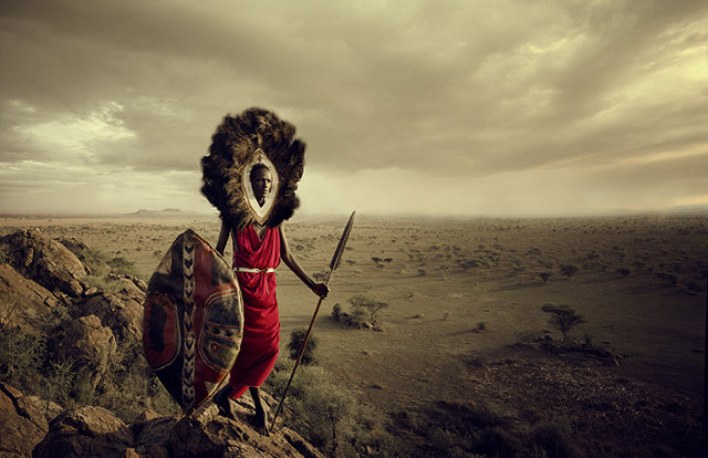 Stunning photographs of disappearing tribes from Jimmy Nelson's new book, Before They Pass Away, have been circulating recently online. Undoubtedly beautiful images, the work has been praised as, "epic portraits that present these dignified inheritors of noble and age-old traditions in a proud spirit and in all their glory—a unique visual experience."Critics offer another point of view as posted in the comments section on Fast Company's website:
This is disturbing. It has popped up a number of times on my newsfeed. It is yet another white westerner's fascination with the authentic and exotic 'other'. This book is totally reminiscent of nineteenth century Social Darwinism and the euro centric belief that 'primitive' cultures were destined to die out when confronted with European 'civilisation'.
I thought what an amazing project then I saw his work on Maori in New Zealand. That is bullshit. No Maori dress like that now and haven't for at least 100 years or more. This is total fabrication. Such a disappointment.
I also wonder about the ethics of such a project since Nelson admits that he couldn't communicate verbally with most of his subjects? Nelson also said "They risk abandoning their authenticity and go towards the material world.” I wonder how much money he will make from his own little piece of material culture.
Nelson says, "I didn't start this project anticipating that I could stop the world from changing. I purely wanted to create a visual document that reminds us and generations to come of how beautiful the human world once was."The controversy surrounding Nelson's work is not new; the beauty of these images brings to mind the work of Edward Curtis. During the early part of the 1900s Curtis undertook a project of photographing Native Americans that would span thirty years, and stir up issues of authenticity and ethics along the way. Creating what many felt were overly romanticized images, Curtis was accused of image manipulation when it was discovered that he had retouched images to remove elements of civilization—as he did in one image that proudly displayed an alarm clock. Some also felt it was not authentic documentation since he posed his subjects and asked them to don ceremonial headdresses and leggings. Curtis felt his portraits gave face to the indigenous peoples of North America, who were threatened by extinction.This question isn't unique to disappearing human cultures; the adoption of the polar bear as a mascot in the fight against global warming raises the same types of questions. Portrayed in Coca-cola ads as pure and adorable creatures, real polar bears have been documented eating their own cubs. One can understand how the cute and adorable polar bear image would engage more supporters than a blood-thirsty cannibal.At the heart of this debates lies the never-ending question that photographers and graphic designers alike wrestle with: what's more important—authenticity—or creating awareness, empathy, and support?Sources:http://www.fastcoexist.com/3021773/see-these-heartbreaking-photos-of-worlds-disappearing-cultures-before-they-fade-awayhttp://www.huffingtonpost.co.uk/2013/11/04/lost-tribes-before-they-pass-away-jimmy-nelson-_n_4212518.htmlhttp://www.nytimes.com/2012/11/12/books/short-nights-of-the-shadow-catcher-by-timothy-egan.htmlhttp://www.loc.gov/pictures/collection/ecur/item/96515425/resource/http://www.coca-colacompany.com/stories/coke-lore-polar-bearshttp://www.dailymail.co.uk/sciencetech/article-2071638/Polar-bears-Cannibal-pictures-prove-theyll-eat-bear-cubs.html
Articulating Un-freedom
 Many of us work hard on our own behalf, or on behalf of our clients, to make sure we get found. Google’s highly protected algorithms claim to make it difficult to pay for SEO (Search Engine Optimization). They want to keep search results fair and organic. That doesn’t stop companies from spending tons of time and money trying to rise to the top of search lists and chase that holy grail.But what about the other side of the fence? What if you don’t want to be found, either in a Google search—or by anyone else, including the US National Security Agency. This past year there has been much debate about the NSA’s secret surveillance programs, in particular PRISM. While the NSA and the FBI have always been known for such practices, the level of invasiveness into private data through servers has never been higher. Many people feel it’s a violation of their privacy and a form of censorship.Graphic designer Sang Mun decided to create a typeface that speaks to this issue. While working as a special intelligence personnel for the NSA, Mun learned how to gather information scanning text for national security and defense purposes. Mun questions whether or not things have gone too far. Should text scanning be used for overseeing American citizens without their permission? He has become dedicated to researching ways to “articulate our unfreedom.”One result of Mun's research was the creation of the unreadable typeface ZXX. The typeface’s name was inspired by Library of Congress’ listing of three-letter codes denoting which language a book is written in. ZXX is used when there is no linguistic content.Mun offered ZXX as a free download hoping many would use it. More importantly, it was a call to action—created to raise questions about privacy and censorship. Mun asks us to look at the omnipresent way our personal information is harvested, and not be afraid to question the intrusions. Mun reminds us that as graphic designers we have the power—and a responsibility—to use our craft to ask these questions.Sources:http://www.huffingtonpost.com/2013/06/25/nsa-font-sang-mun_n_3490903.htmlhttp://blogs.walkerart.org/design/2013/06/20/sang-mun-defiant-typeface-nsa-privacy/http://www.loc.gov/standards/iso639-2/php/code_list.phphttp://www.washingtonpost.com/investigations/us-intelligence-mining-data-from-nine-us-internet-companies-in-broad-secret-program/2013/06/06/3a0c0da8-cebf-11e2-8845-d970ccb04497_story.htmlhttp://www.theguardian.com/world/2013/jun/06/nsa-phone-records-verizon-court-order
Take the Pledge
 Some of you may recognize this three finger pledge from your Girl Scout days when you were asked to recite the Girl Scout Law:I will do my best to behonest and fair,friendly and helpful,considerate and caring,courageous and strong, andresponsible for what I say and do, and to respect myself and others,respect authority,use resources wisely,make the world a better place, andbe a sister to every Girl Scout.The three fingers stand for 1) honoring God, 2) helping others, and 3) obeying Scout Law. Graphic designer and author David Berman feels graphic designers should take a pledge of their own—one that focuses on the second principle,helping others. Berman recently released a new edition of his book, “Do Good
 Design.” Along with its release, he has asked graphic designers to take the pledge and:1. Be true to their profession2. Be true to themselves3. Use 10% of their professional time to create a better placeDuring a live interview at the recent “Voices That Matter” conference, Berman said his mission is to first talk to designers about how much influence the work they do has on our world. He uses the environmental crisis as an example and its connection to over-consumption, speaking about the role that advertising and graphic design have in promoting a consumer culture. Berman believes once graphic designers realize how much power they have in influencing people, they will understand how they can use some of this power to make the world a better place. In doing the math, Berman feels there’s a potential for 8 million hours of time from designers that can be devoted to doing good. He has already has received over 112,540 hours in pledges.Berman’s position is one that is that has been debated widely. What is the role of a graphic designer and what is good design? Is it to simply create beautiful and effective things, or is it, as Berman and many others feel, to do good with? What do you think, are you willing to take the pledge?Sources:http://www.davidberman.com/social/dogood/http://www.girlscouts.org/program/basics/promise_law/http://en.wikipedia.org/wiki/Scout_sign_and_salutehttp://www.youtube.com/watch?v=QtnazQE7RPA
Girl Power
 March is Women's History Month. Today, March 3, is the 100 year anniversary of the suffragists march on Washington. Friday, March 8, is International Woman's Day. It's the perfect time to look the power of graphic design and the ways that has been used to affect women—starting with girls.Frog Design teamed up with Girl Effect to co-design for social impact. Girl Effect, a nonprofit collaborative movement that includes the Nike Foundation, the NoVo Foundation, the United Nations Foundation, and the Coalition for Adolescent Girls, works to alleviate poverty by investing in girls. The project that Frog Design worked on explored the nature and value of digital connections for young women living in poverty. You can learn more about the project by watching this video: Nike Foundation: The Girl Effect."India: Gender Equality," created by Design Global Change, received a "Sappi Ideas That Matter" Grant in 2010. Design Global Change created a set of cards depicting Indian men and women in various roles (collecting water, farming, selling goods, etc.) The goal of the project was to trigger conversations about gender issues among high school youth and to provide educational activities to raise awareness. You can view the project here.What design projects have you seen that are intended to empower girls?Sources:http://www.frogdesign.com/work/girl-effect.htmlhttp://designglobalchange.virb.com/india_gender#/i/1
Turning Trash into Treasure
 “Waste Land" was a project created by the artist Vik Muniz where he enlisted the help of workers from the world's largest garbage dump, Jardim Gramacho, located on the outskirts of Rio de Janeiro, Brazil, to create art out of garbage. Muniz raised over $250,000 when he brought the portraits that were created to an auction house in London. Mr. Muniz donated his $50,000 take for the sale of one man's portrait to the workers’ cooperative. An award-winning documentary with the same name was released in 2009 and some of the project's participants visited the Museu de Arte Moderna in Rio to see themselves in Mr. Muniz’s 2009 retrospective. “Sometimes we see ourselves as so small,” one tells reporters at the opening, “but people out there see us as so big, so beautiful.”
 In Cateura, Paraguay, Favio Chavez, an ecological technician at the landfill the town is built on, creates instruments for a young people's orchestra from trash. The “Recycled Orchestra” quickly gained more students than instruments. The students are beginning to take tours around the world and filmmakers are working on a new documentary, "Landfill Harmonic," to tell their story.
 Another recent project intent on raising awareness about litter was created from 1.7 tons of garbage found on Mount Everest. 15 Nepali artists spent a month creating more than 75 sculptures from empty oxygen bottles, torn tents, ropes, boots, and every kind of camping equipment imaginable. Yaks, wind chimes, prayer wheels, and all kinds of unique sculptures were created. The works were exhibited in Kathmandu.
 The mission of Emergent Structures, located in Savannah, GA, is to increase the value and accessibility of building material waste streams through facilitation, collaboration, education, and advocacy. Some of their projects have included a collaborative fundraiser with the Humane Society of Savannah that began with a call for submissions for custom built cat or dog structures made from reclaimed materials and the "This Ain't Junk" repurposing competition with Savannah’s Habitat for Humanity. Emergent Structures wants to publish stories from all over the world about reclaiming materials and encourage people to submit their projects to Exclaim Your Reclaim.San Francisco's Recology Artist Program in Residence provides Bay Area artists with access to discarded materials, a stipend, and a large studio space at the Recology Solid Waste Transfer and Recycling Center.
 Closer to home, one of my students, Rick Diguez, was recently inspired to create a book made out of discarded stainless steel, left over scrap from a gutter installation. The result was a finely crafted book that pays homage to some of his favorite artists.
 Also local for me, the Newburgh Mural Project is a series of inspiring outdoor paintings featuring the work of Chilean artist Dasic. This project has transformed old buildings and tunnels into works of art bringing beauty into neighborhoods struggling with poverty and crime.What have you seen lately that inspires you to turn trash into treasure?Sources:http://www.emergentstructures.org/http://www.good.is/posts/landfill-harmonic-making-music-from-trash-in-a-paraguay-slumhttp://www.recologysf.com/AIR/http://www.sierraclubgreenhome.com/uncategorized/one-mans-trash-is-another-mans-art/?pid=1836http://www.theatlanticcities.com/arts-and-lifestyle/2012/11/turning-mount-everest-trash-treasure/4008/#http://www.wastelandmovie.com/synopsis.htmhttp://video.nytimes.com/video/2010/10/20/arts/design/1248069211361/clip-waste-land.html
Social activism, served best with a side of laughter?
 It's been almost a year since the Yes Men launched the Yes Lab, an organization devoted to helping activist groups carry out media-getting creative actions. The Yes Men, Igor Vamos and Jacques Servin (also known as Andy Bichlbaum and Mike Bonanno,) are culture-jamming activists who have been creating actions since 1999. Their work focuses on creating parody and involves the impersonation of famous figures or creation of bogus media campaigns. As Paul Kuttner, author of the blog Cultural Organizing, said last year in anticipation about the launch Yes Lab, “organizing and activism could be a lot funnier.”(1)Although delivered with humor, the issues that Yes Lab addresses are far from laughing matters. Earlier this year they caused a stir when they launched the website arcticready.com and the Let's Go! Mercy Poll, a mock poll that encourages users to vote for which arctic species deserves extra protection from the US government's "incidental harassment authorization" that was granted to Shell. The site also features Social Media ads and a game just for kids, Angry Bergs.Another of Yes Lab's projects included "Three Strikes, You're In!," targeting the New York Police Department and McDonald's. The campaign offered free Happy Meals™ to anyone stopped and frisked three times without charge or summons to compensate victims of the NYPD's racist and abusive "stop and frisk" policy. They created a parody website and video (no longer available for viewing) which mimicked the official NYPD website along with the mock coupon to be brought in to claim their meal. According to Terry Malloy, author of the press release, McDonald's was included because they have made millions off of serving low nourishment food to African-American communities. (2)Last week Yes Lab posted about Shell again, with "Murder is Bad. Even in Nigeria." The article is about Shell's attempt to block employees access to the activist website, Murder is Bad, created by People Against Legalized Murder (PALM). The site's goal is to let people know about Shell's involvement in murders in Nigeria, and their actions to cover it up, including the recent court case, Kiobel v. Royal Dutch Petroleum.What do you think, is a social message best served with laughter? Are there any risks involved when creating mock campaigns that are often mistaken for being real?You can read about 5 more protests that shook the world with laughter at Yes Magazine.Notes:(1) http://culturalorganizing.org/?p=316(2) http://www.businessinsider.com/365black-mcdonalds-nypd-frisking-3-strikes-youre-in-2012-3#ixzz28zlvjxxu Sources:http://yeslab.org/http://theyesmen.org/http://murderisbad.com/http://culturalorganizing.org/?p=316http://www.businessinsider.com/365black-mcdonalds-nypd-frisking-3-strikes-youre-in-2012-3http://www.yesmagazine.org/issues/beyond-prisons/5-protests-that-shook-the-world-with-laughter
The Power of Photoshop Users
Much has been written about the atrocities of Photoshop. It has been used for all kinds of photo manipulation; some is considered racist, like the OJ Simpson image that graced Time magazine's cover; some is considered dangerous and ridiculous, like the Iran missile image explosions; and other users are considered anti-feminist and irresponsible as shown in this video "Killing Us Softly 4: Advertising's Image of Women" with Jean Kilbourne.
 Much has been written about the atrocities of Photoshop. It has been used for all kinds of photo manipulation—some is considered racist, like the OJ Simpson image that graced Time magazine's cover; some is considered dangerous and ridiculous, like the Iran missile image explosions; and some is considered anti-feminist and irresponsible as shown in this video "Killing Us Softly 4: Advertising's Image of Women" with Jean Kilbourne.Is it true that the best Photoshop work goes unnoticed? Richard Fisher states just that in a post entitled, "Photoshop – the Good, the Bad and the Ugly." The post goes on to say, "when used correctly, it enhances a photo and can be used to remove flaws. Clearly its good practice to check and improve any photo you use even if it is just making sure the contrast is ok. Untidy or low quality images look unprofessional and can reflect badly on your brand. But it’s about being subtle, about having the skill to change and adjust the image so that it is improved without revealing the process of improvement." (1)A recent presentation on TED Talks by photo retoucher Becci Mason focuses on how Photoshop was used to bring joy and memories back to those affected by the devastating 2011 tsunami in Japan. Mason had traveled to the scene as part of a relief effort, All Hands, and while there discovered the damage done to photos, albums, cameras, and memory cards. Using social media to gather over 1,100 volunteers, she created Photo Rescue Japan to spearhead the effort to restore the images. Over 135,000 photographs were cleaned, and hundreds were retouched and returned to their owners.Mason's efforts aimed to restore the images to their original state, not to obviously look photoshopped. But what about the obvious uses of photoshop? There are occasions when obvious manipulation can be used for good. Chaz Maviyane Davies is a graphic designer who uses Photoshop to create images for social activism. His website, maviyane.com, aptly named "Creative Defiance," shows powerful examples of how manipulated images don't only have to be used for advertising and consumerism. Davies also lent his creative efforts to helping Tsunami victims by creating a powerful image that was commissioned to raise funds to aid victims.Photoshop itself is merely tool in the hands of its users, without an end user it is nothing—they are the ones with the power. What have you seen that appalls you? Inspires you?Notes:(1) http://www.graphicdesignblog.co.uk/photoshop-the-good-the-bad-and-the-ugly/Sources:http://www.fourandsix.com/photo-tampering-history/tag/race-and-genderhttp://www.graphicdesignblog.co.uk/photoshop-the-good-the-bad-and-the-ugly/http://www.petapixel.com/2012/08/04/retouching-lives-through-photos-and-using-photoshop-for-good/http://thelede.blogs.nytimes.com/2008/07/11/photoshop-frenzy-on-iran-missile-tests/http://youtu.be/9JKy6ZfmBn0
Is Kony 2012 tony, or phony?
 Kony 2012—the slick and emotional video by Invisible Children that has been circling the internet through Facebook posts, reblogs, and other forms of viral marketing—has been under attack this week. Critics are claiming that is irresponsible, self-serving, and a ploy for mass merchandising.With a campaign that asks supporters to "get the kit," some feel that Kony 2012 has become more than a campaign for justice—it's also become a source of revenue for its founders. Posters, bracelets, hoodies, and t-shirts are also for sale there and other places online. Questions about how much money is going to Jason Russell (its co-founder and filmmaker) vs. how much is actually going to the children have been raised. In response to this criticism Invisible Children has posted a response which includes a breakdown of expenses along with their financials.College student Grant Oyston never expected he would get over 2.3 unique views when he wrote the blog post Visible Children: Criticizing Kony 2012. Oyston says he wrote about the issue because he felt that people were jumping on the bandwagon to follow this campaign without doing research into either the organization Invisible Children or the war in Uganda. He said that up until his blog post came up he could find very little written about these issues.The poet Suli Breaks thinks the backlash against the Kony campaign is more a matter of cynicism. In a short response on YouTube he asserts that if the civil rights movement was going on now his generation wouldn't buy it. Suli goes on to say people have jumped from the Kony campaign to the anti-Kony campaign—without researching either stance.Many people, including Op-Ed NY Times columnist Nicholas Kristoff, have come out in favor of the campaign, saying that over the years he has seen that public attention can create an environment in which solutions are more likely. The top education official in Gulu, Uganda, Vincent Ochieng Ocen confirms this view as he explains the complexities of the war that has been waged for 20 years and affects not only Uganda, but other areas of Africa.Oysten and others, including Chris Blattman, a sociologist at Yale University, would argue differently. Blattman says, “There’s also something inherently misleading, naive, maybe even dangerous, about the idea of rescuing children or saving of Africa. […] It hints uncomfortably of the White Man’s Burden. Worse, sometimes it does more than hint. The savior attitude is pervasive in advocacy, and it inevitably shapes programming. Usually misconceived programming.”Another concern voiced by critics is that the campaign capitalizes on people's short attention spans; people will think they have done enough simply by posting one link or wearing a bracelet.When I discussed the campaign with my graphic design students most of them had heard about it, seen the video, and knew of the controversy that it had stirred up. There was a general consensus that they should support the cause, but not the campaign. They also agreed it was an excellent example of branding—acknowledging the slick and well executed video had powerful emotional appeal. This led to a discussion that included brand stretching, greenwashing, and social responsibility. At the very least, the campaign is a catalyst for the discussion of many of the ethical issues involved in graphic design.Sources:http://africasacountry.com/2012/03/07/phony-2012-risible-children/http://www.kony2012.com/http://www.youtube.com/watch?feature=player_embedded&v=dtYhk0K_WcEhttps://vimeo.com/38609658http://www.invisiblechildren.com/critiques.htmlhttp://www.nytimes.com/2012/03/15/opinion/kristof-viral-video-vicious-warlord.html?scp=1&sq=kony%202012&st=csehttp://visiblechildren.tumblr.com/post/18890947431/we-got-troublehttp://www.usatodayeducate.com/staging/index.php/ccp/college-students-blog-post-opposing-kony-2012-campaign-goes-viral
Embracing Kingian Principles to Promote Nonviolence
Promoting Nonviolence
 This mural was painted on Albany Ave. in the North End of Hartford, Connecticut in November 2010. It was a Design Global Change project, an organization founded by Professor Natacha Poggio of Hartford Art School that is a creative think-tank that uses design to develop projects that bring positive change to communities around the world.The mural was inspired by the Kingian Principles of Nonviolence promoted by Dr. Martin Luther King Jr., with special attention to principle #2: "The beloved community is the frame work of the future." The painting was created in collaboration with the Connecticut Center for Nonviolence, Hartford clergy and Community Peacebuilders.Kingian Principles of Nonviolence
- Nonviolence is a way of life for courageous people.
- Nonviolence seeks to win friendship and understanding
- Nonviolence seeks to defeat injustices, not people.
- Nonviolence holds that suffering for a cause can educate and transform.
- Nonviolence chooses love instead of hate.
- Nonviolence holds that the universe is on the side of justice and that right will prevail.
How can you help promote nonviolence?Sources:http://designglobalchange.virb.com/http://bit.ly/zR9t50
’Tis the Season for Giving Back
Graphic design with social responsibility goes on all year round, but the holiday season shines an even brighter light on how graphic designers are giving back. Following are just a few examples: Watch this CNN Report about a project done by students for Stefan Sagmeister's "Touch Someone's Heart" at the School of Visual Arts in New York City to create a virtual community for NYC's M15 bus line commuters.The Byne Group is a small design agency in Suffern, NY that decided this holiday season they would donate a dairy cow to a family in Africa on behalf of their clients and friends. Watch their holiday greeting.
 Please share any projects you've seen that are giving back here.Sources:http://ireport.cnn.com/docs/DOC-710199?et_mid=529211&rid=102291436http://imprint.printmag.com/daily-heller/happiness-is-a-warm-cushion/http://thebynegroup.com/cows